Project Overview
Summary
Thrift started of as a personal project during mine and my friend Lukas Arnold's time at Playgroundsquad. Both of us knew that we wanted to make something bigger than we could on our own; so we decided to collaborate.
The goal was to create a small vertical gameplay slice taking inspiration from some of our favourite games: Dishonored & Thief.
We ended up with a game where the player has a lot of freedom in their movement. They can vault over any ledge and are equipped with a gun capable of placing platform on any surface.
For the project I was doing most of the programming in Blueprints and focused my design on Gameplay & UI. Below you will find a handful of the systems I made for the game.
Deepdives
The system to vault over any ledge proved to be quite a hassle to set up and is split into three parts -
We still had some issues where the player would get stuck inside meshes, we figured out that the traces sometimes started inside the mesh and would not collide with anything at all. We solved the issue by making our geometry double-sided which made our performance take a hit, but with the game being so small it was not a big issue for us. Vaulting now works in pretty much all the places we tested without any major issues.
This other graph for vaulting is the auto-crouch. I added it because we felt that the player would be limited in their movement if they could not vault where they would have to end up crouching at the end. This allowed for more open level design where you could vault into slips and smaller entrances.
As for the actual vaulting itself I decided to “animate” the player with code. First giving them a slight backwards offset and then climbing up & forward. This gives the vaultinga smooth feeling while also seeming somewhat more realistic.
This “animation” also has the added benefit of preventing the player avatar from clipping into the wall or the ledge so it becomes a nice double win!

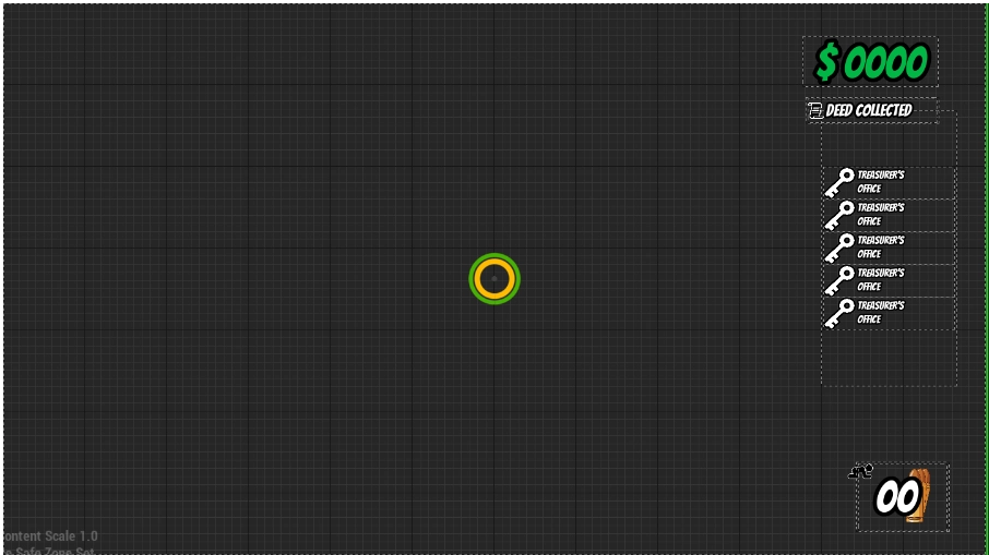
The UI was a fun one for me. I wished to make a simplistic and minimalistic UI with the most important element shown clearly and without disruption. This ended up as the final design.
It is quite right-side-heavy but I find that it gets all the necessary information across without cluttering the screen. The circular bars in the middle represent lockpicking progress and stamina respectively.
These fade out when they are not currently in use (ie. empty for lockpicking & full for stamina) The only persistent elements of the UI are the money counter, ammo counter & collected keys which should all be visible to convey what resources the player is currently carrying so that they may plan their route accordingly.
Slightly Above (to the left) of the ammo counter is the crouch status-icon. This icon appears when the player is crouching to signal the character’s sneaky and slow behaviour.

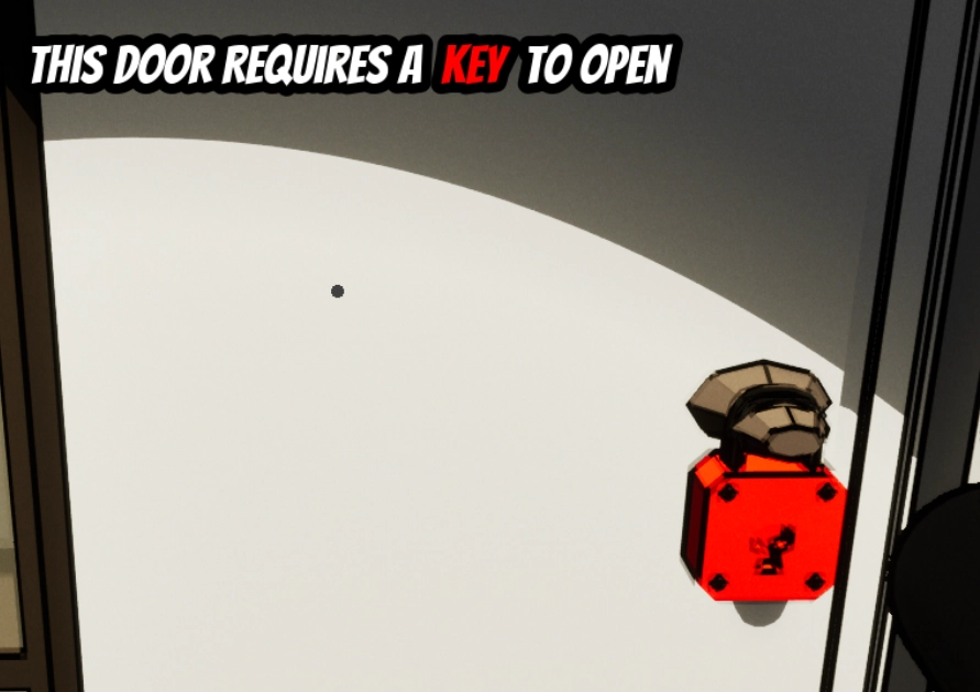
Another aspect was the Interact Prompts. I decided to make these into worldspace widgets that keep to the style with thick black borders. In the event of doors that require a certain key, we have made sure to color code the word with the color of the lock & the key. This is all automated and set up via the door making it easy to configure each instance. Every interactable in the game has a prompt and a key to trigger the interaction.
One thing that has always been frustrating in stealth games is the lack of information which makes it hard to plan your sneaky ventures ahead of time.
I wanted to solve this issue by introducing footstep prompts. Together with actual sounds being emitted, if the player is in a reasonable range from the footsteps they will also be able to see them to give further information regarding positions of guards.
However, to not make the player rely solely on this mechanic we added some stationary guards around the map as well that will catch an unsuspecting player off guard if they abuse the footstep prompts.
Learning to utilise the construction script was a fun experience. I wanted to make as many of my map-actors changeable and instance editable to make it easier for Lukas to place them where he saw fit and customise without too much hassle. This ended up being quite an interesting thing to develop and I will definitely keep making construction scripts for myself and others in the future!
During Thrift I interconnected the gameplay and cosmetic logic of these actors. Later I learned about inheritance and has preferred that workflow over what I did here, even if I still use the construction script to run cosmetic changes to this day!
Other than elements of the project listed above I also fiddled with making some art in the form of a material that sticks to surfaces as well as two post-processing materials to make the game get a stylized look via thick outlines & a cel shader.
The Cel shader was made following a tutorial by UnrealCG and altering it slightly to more align to our desired look and feel.
Similarly, the outline Post-Process Material was made following a tutorial by Ben Cloward. Mostly altering the parameters & attempting to add a slight camera fall off to the outline.
The displacement or “sticky” material was inspired by a post by Unsweet on Artstation. This material was used for the platforms that the projectiles produce to give it a really sticky look.